Visual artist Daniella Batsheva, was recently named the first-ever female Lead Illustrator at Kerrang! - an alternative culture brand that has been around for more than 40 years. Batsheva clearly has a deep love of horror and its influences are evident in her work, a hybrid style that conjures up heavy '90s vibes always with a dash of underlying grotesque (just the way we like it). Batsheva also designed the trophy for the Shriekfest horror film festival, and did the promo art for Sam Raimi’s film Crawl. Batsheva joined us to discuss influences, the underlying air of horror lurking (and overtly) in her work, and what it's like to be the first-ever female lead illustrator for Kerrang!
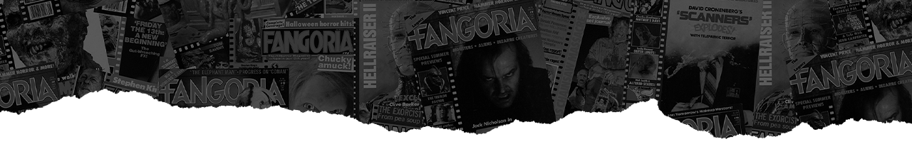
I couldn't help but notice in one of your pieces (Weed), a girl is sporting what looks like a sleeve dedicated to Plan 9 From Outer Space. I know you're a horror fan, what are some of your favorites and how has that influenced your work and your style? Do you often find ways to work little things in like that either as an easter egg or another level of commentary?
Oh my god, someone noticed! I'm so happy! Yeah, sometimes I'll slip in those easter eggs wherever I can because I get a kick out of someone noticing a sneaky Moomin or Cenobite. Sometimes there's another level of commentary, just to hit it home. My details can sometimes carry their own stories entirely. I'm more of a fan of the older films, I like everything from German Expressionism to Hammer films, mainly films that have a more fantastical, surreal quality. I want to be whisked away from reality so I can see someone else's colorful nightmares in the same way as visiting a haunted house.
I love The Golem, Nosferatu, The Vampire Lovers, Hellraiser, Puppetmaster, but my all-time favorite is Dolls. Dolls is the coziest little film ever, and I love all the little teefs on those tiny killers. I think the way horror carries through to my work is less about the characters themselves and more about the atmosphere. Those films very heavily influence the environments I create and taught me how to weave an air of unease.
You often mix a sort of grittiness juxtaposed against a bright, poppy color scheme. What are some of your influences?
Horror films, of course. But I'm also a big fan of Rococo, Art Nouveau, and Victorian-era illustrations. I frequently try to channel the same sort of magic that Georges Méliès' pieces have, but while having the color palette of a '90s cartoon? My influences are all over the place. It really depends on my mood!

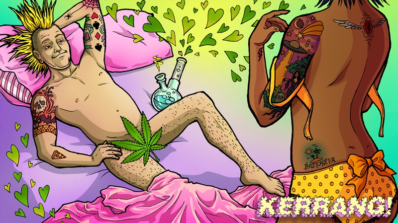
We talked about your more brightly colored pieces, but some of your darker (both thematically and literal color palette) works have an incredible melancholy and convey a real sense of isolation. Can you speak on that a bit?
Yes, absolutely. Isolation is actually a major theme in my work, though it's not always a negative element. People, to me, always seemed dangerous and problematic, though I've softened on that belief in recent years. I spent most of my early years in unstable environments where sometimes there wasn't enough to eat, or utilities were cut off. When I lived in Israel during the Intifada, I missed a suicide bombing at a toy store by minutes. Being alone made me feel much safer in those days, and I think that carries through in my work.
It probably doesn't come as a surprise that I relate more to monsters than I do to the "people" in horror movies. I do enjoy my own company more than most others, so the pieces I create now often have a warm, but unnerving, solitude. My own little spooky safe space!
There's always this underlying air of something amiss. On the surface, it might look like a brightly lit, poppy, colorful ad, but then you look closer and the grin is just a little off, a little maniacal. Or a head is exploding, or there's slime oozing down the walls. But even in the pieces that are not overtly horror, there is always the underlying essence of horror. Of something not quite "right" which makes me think of the horrors of suburbia, the shit beneath the facade of the picket fence and pop culture etc. What is your inspiration for that, or what's on your mind when you're creating a piece like that, do you set out knowing it's going to have something that feels a little sinister lurking beneath the surface?
The sarcastic element does stem from poking fun at the facade of twisted normalcy, and I think that the social climate in Los Angeles fostered that quality. In my experience, someone who tries that hard to present a squeaky clean image is usually really messed up. The sugary smiles are off-kilter, everything in the environment is holding its breath, barely keeping it together, on the cusp of having the hidden duct tape give up its grip. It's all a bit of an act, isn't it?
When you're surrounded by people who present themselves like Pepsi billboards, all image and brand-absorbed, it gets to be grating on the nerves. This isn't all social/political statements though, I do enjoy making things look "off" because I think it's a lot more fun! I can't do the cheesy, happy Norman Rockwell stuff, even if I tried. It feels too insincere in this day and age. Unless a client specifically requests that I cool it on the underlying discomfort, it's something I choose to embrace.
My work also has a heavy punk influence. My first conscious exposure to art was through punk flyers, the kind made on shitty photocopiers or ones that were carefully illustrated. The works of Dave Glass Riddick were my favorite. To me, that was art, beyond anything you could've shown me in a museum. I frequently channel that vibe in my work and hope it comforts some wonky kids the way other artists did for me.
Tell us a bit about your cultural background and how you embrace and integrate that into your art.
My cultural background is a bit of a mess because each one of my grandparents was displaced due to WWII. I grew up in a heavily Yemeni-Israeli household, so English was rarely spoken, and the foods I ate would've scared most of my classmates. Being an unruly creature that gravitated toward punk music and spooky movies, I mingled with kids that were largely white and Christian. I passed for white, while my mother did not, and people would frequently refer to her as "the help" when I was young. We lived in a neighborhood with a lot of low-key KKK members, so she always told me just to nod if someone asked me about Christmas dinner or whatever. Cover up how different you actually are because people might want to hurt you for it.
I couldn't integrate it. I couldn't bridge the gap between my ethnic background and the things I loved. I didn't know how because I hadn't seen it done, but now I want to try. I don't want to hide from it the way I used to. Now, we actually are seeing more Jewish people getting involved in the alternative and telling their stories in horror films, but it's mostly from an Eastern European perspective. So I'm beginning to explore Middle Eastern Jewishness through a darker, fantastical lens in my work. I was offered gallery space in London, so I'm hoping that once I get a big enough collection of pieces, I can put together an exhibition.
Investing in your local community and independent artists is important to you, can you talk about some of the ways you show support to your community?
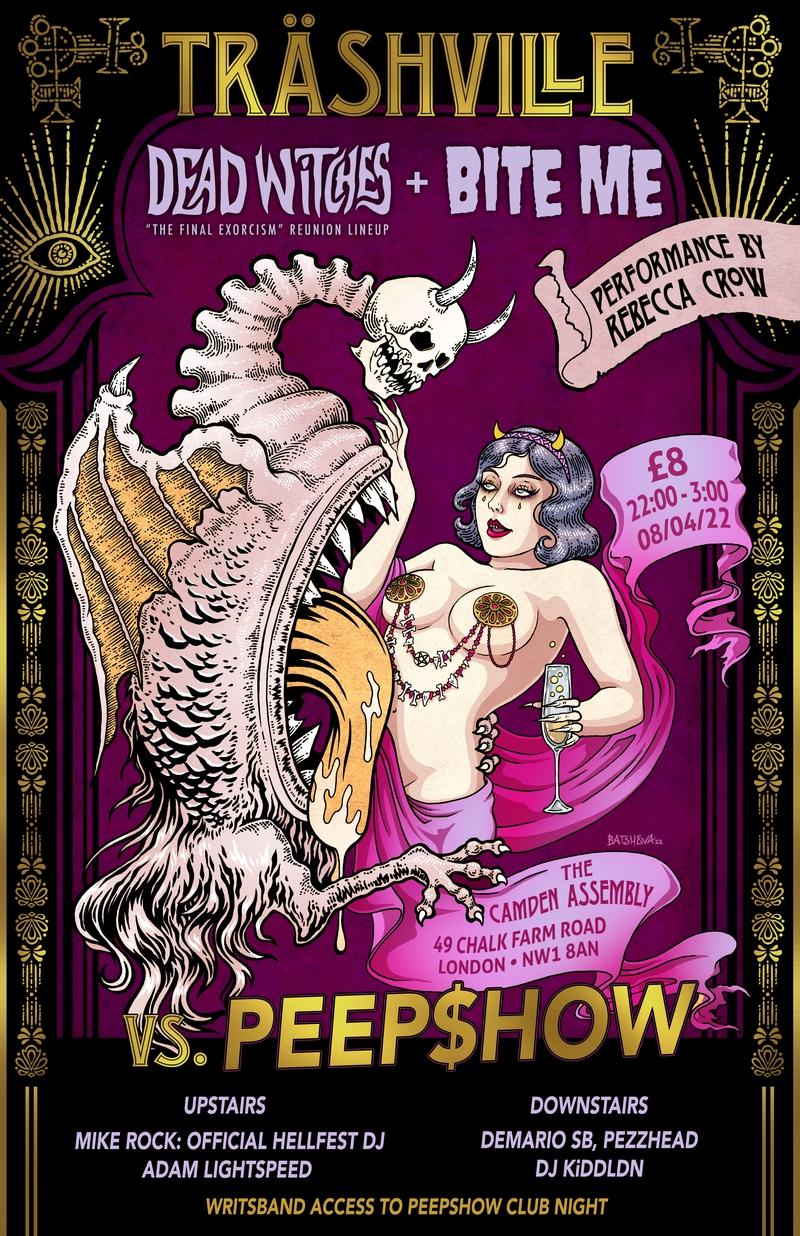
I've always found that there was room for me in the horror community and in the underground music scenes. It's those communities that I want to give back to and help bolster with my work whenever possible. For the past several years, I've been working with Arnö Vön Detritus on illustrated posters for numerous venues and acts, mainly in London. Most recently, Arnö and his partner Ruby Alexia have started up Träshville, an entertainment and art collective, and we've created numerous pieces together. It's extremely rewarding because, oftentimes, bands will not have artwork or won't expect much more than a shitty flyer. So once in a while, I'll surprise people with a full-blown illustration. I've seen some tearful appreciation, and it means the world to me.

Down the line, I'm really hoping I can find a way to contribute my skills to something environmental like London-based Thames21. It's no secret that art these days isn't taken as seriously as it once was, and I think I want to prove that it's still important. Art can still have a positive impact.
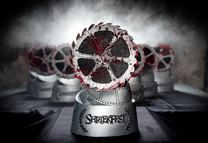
You also did the Shriekfest horror film festival trophy design, how did that come to be?
Yeah! Denise Gossett, the founder of Shriekfest, was actually looking for a designer, and I just tossed my name in the hat. It was very unceremonious, but I think everyone was happy with the outcome. As with independent music, I always want to be involved whenever possible, so I was happy to take on the project of designing the Shriekfest trophy. The trophy was actually parodied in a TV show called Speechless, which aired on ABC a few years ago. Supposedly their main character won an award at a horror film festival that was an exact copy of my design. I've seen screenshots, but I never watched the show.

You were recently named the first-ever female Lead Illustrator at Kerrang! What does that major milestone mean to you?
It's really been an honor to contribute to the team at Kerrang!. Personally, it means a lot because it shows that alternative subcultures are becoming more open and inclusive. I'm not sure someone like me would've been given this opportunity 20 years ago, so I'm very proud of it. Brand Manager, Esme Surfleet, trusted me to provide Kerrang! with visuals relating to culture, arts, and mental health, as well as the recent June print cover featuring Green Day, Fall out Boy, and Weezer.

Seeing the way the alternative is shifting to include the voices of women and POC has been very inspiring. Circling back to my point about integrating my cultural background with my interests, I feel like I can do that now, without judgment. I can be me, and Kerrang! accepting me as I am further solidifies that, and I'm grateful for it. It's been a wonderful experience, and I can't wait to see what the future holds for Kerrang!.
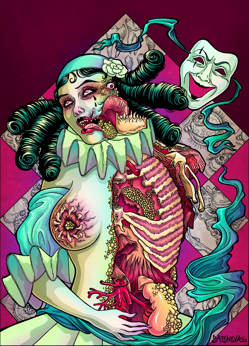
The exclusive art piece you made for FANGORIA is awesome! What was the inspiration behind that?
Thank you! I'm so glad you like it! Creating an exclusive piece for FANGORIA has been so much fun, and I'm honored to do it. I've been a reader since I was a wee one, so my inner child is squealing right now!
This is one of those moments where I was able to choose the subject matter, so I took advantage of it. I've been itching to draw another Pierrette, the female counterpart to Pierrot, for quite a while but never found an opportunity until now. I love Pierrot as a figure because he represents a naïveté that's frequently made fun of and can be teased to the point of cruelty. Rather than simple jokes, I ramped up the agony to something like surgical theatre. I'm also a big fan of wrong anatomy from historical drawings, so I added a little of that body horror flair to the macabre display.
Check out more of Daniella Batsheva's work here.